How Otter Now Kiosk helped 8+ brands streamlined their order flow.
Otter Now is a self-service ordering kiosk for F&B tenants by reducing the need for cashier registrars and replacing it with an easy and intuitive Kiosk. The goal of this project is to get higher order accuracy, reduce wait time for customer and increase order volume.
Scope of work:
PRODUCT DESIGN & DESIGN SYSTEM
Industry:
Food & Beverage tech
Tools:
Figma
Ordering food should be fast and easy right?
In reality, it can't be like that because…
Customer often hold lines just because they are not ready to order.
In small F&B tenants, the cashier person often goes back and forth because he handles both taking order and delivering the order, making a long queue.
But what about Kiosk? Kiosks have different layouts depends on the provider, for example McDonalds Kiosk and local Kiosk provider has different layout. Therefore, users must “learn” or adapt how to order using specific machines.
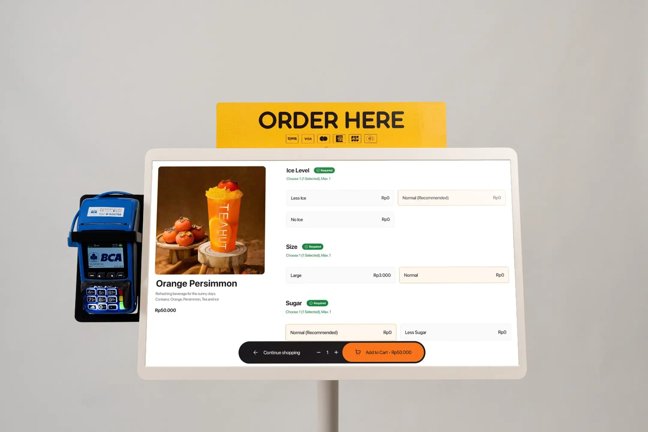
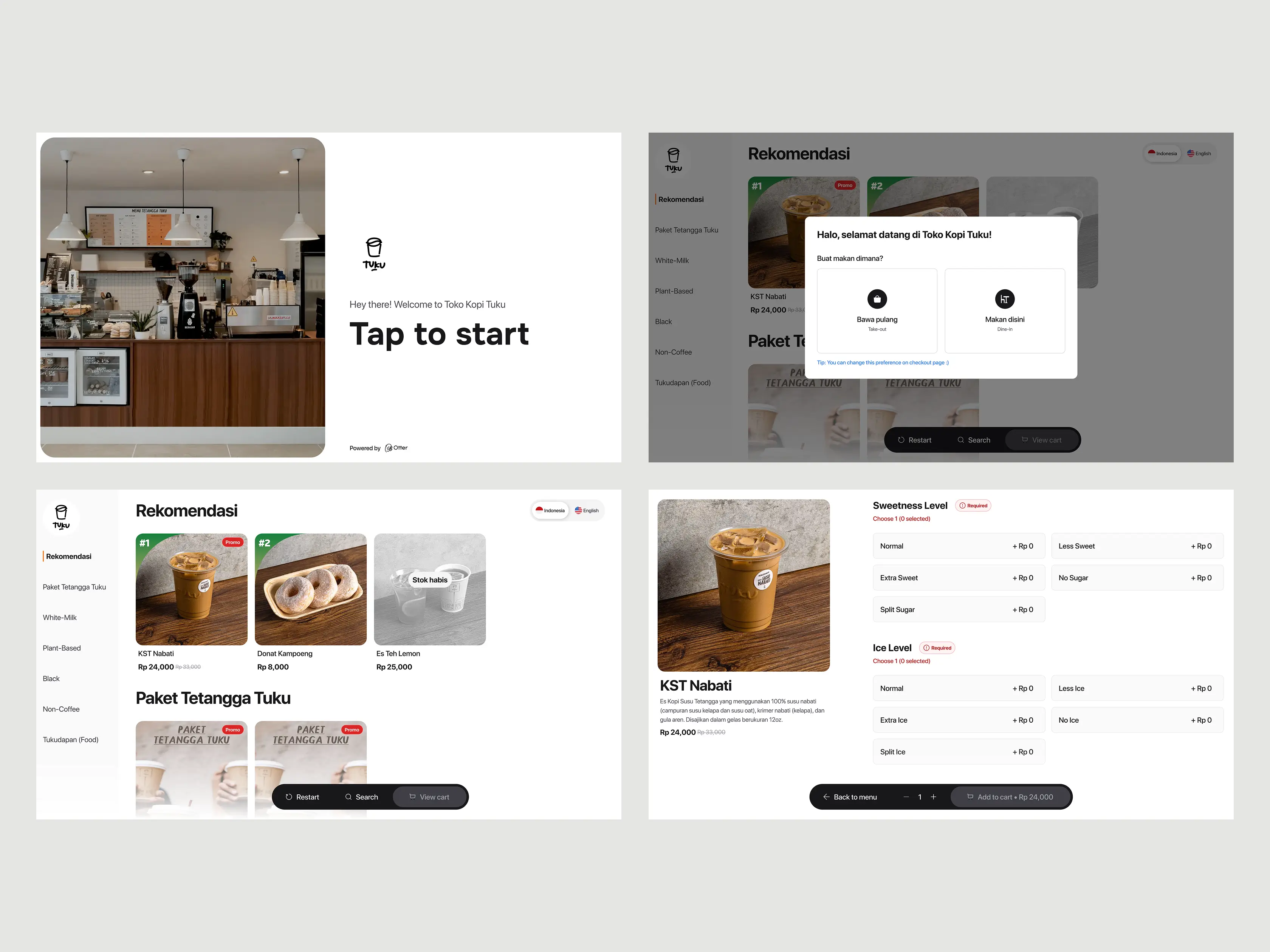
Big screen design opportunity
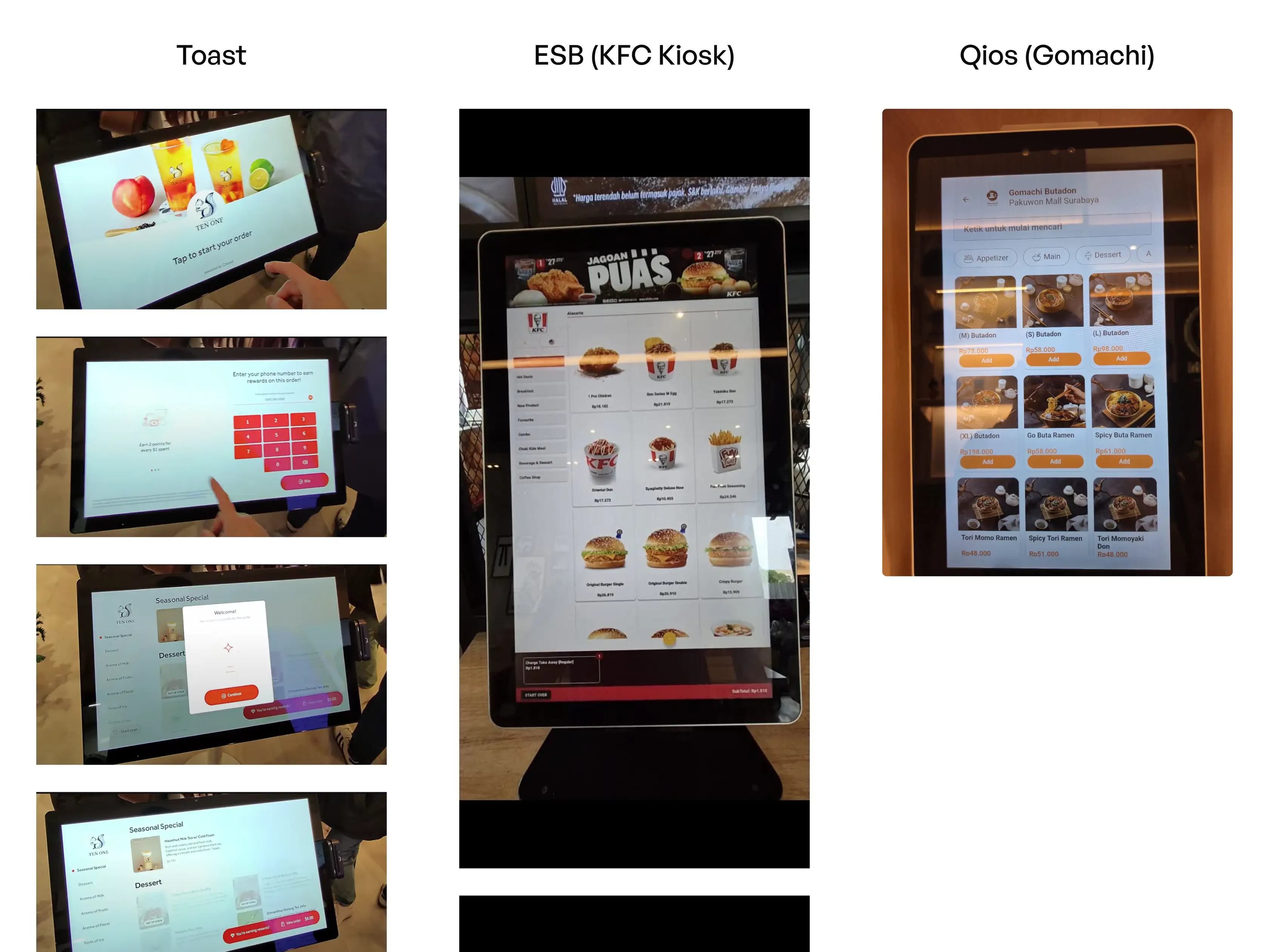
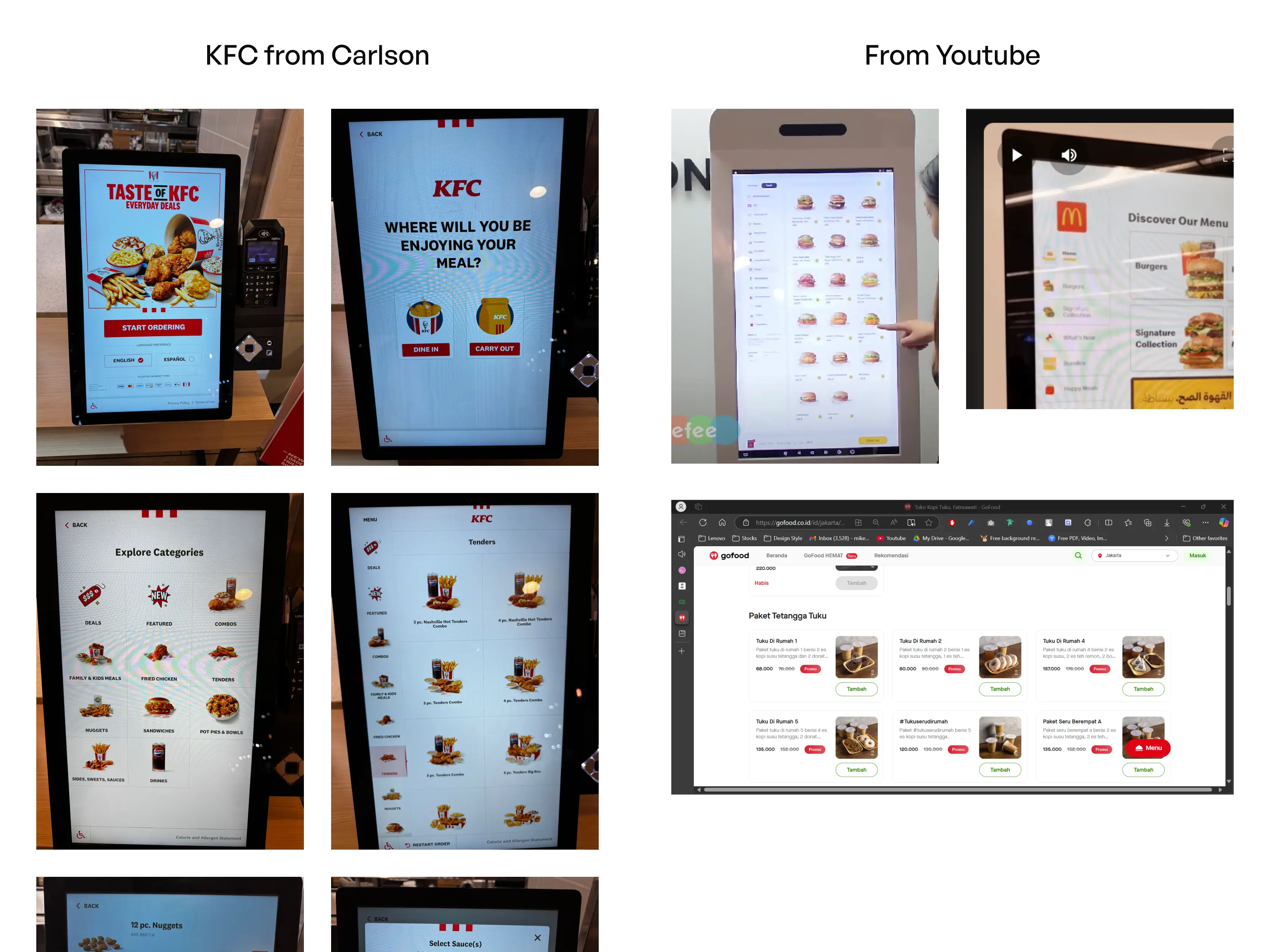
Due to our time constraint, we do onsite research on nearby KFC and Gomachi Pakuwon Mall, Surabaya to gain insight of how the usual flow of is for Kiosk, because it's my first time designing a product larger than desktop PC screen.
Other than onsite research, we also have desk research session where we collect information from Youtube videos and insights from the founders on WhatsApp.
Our design decisions
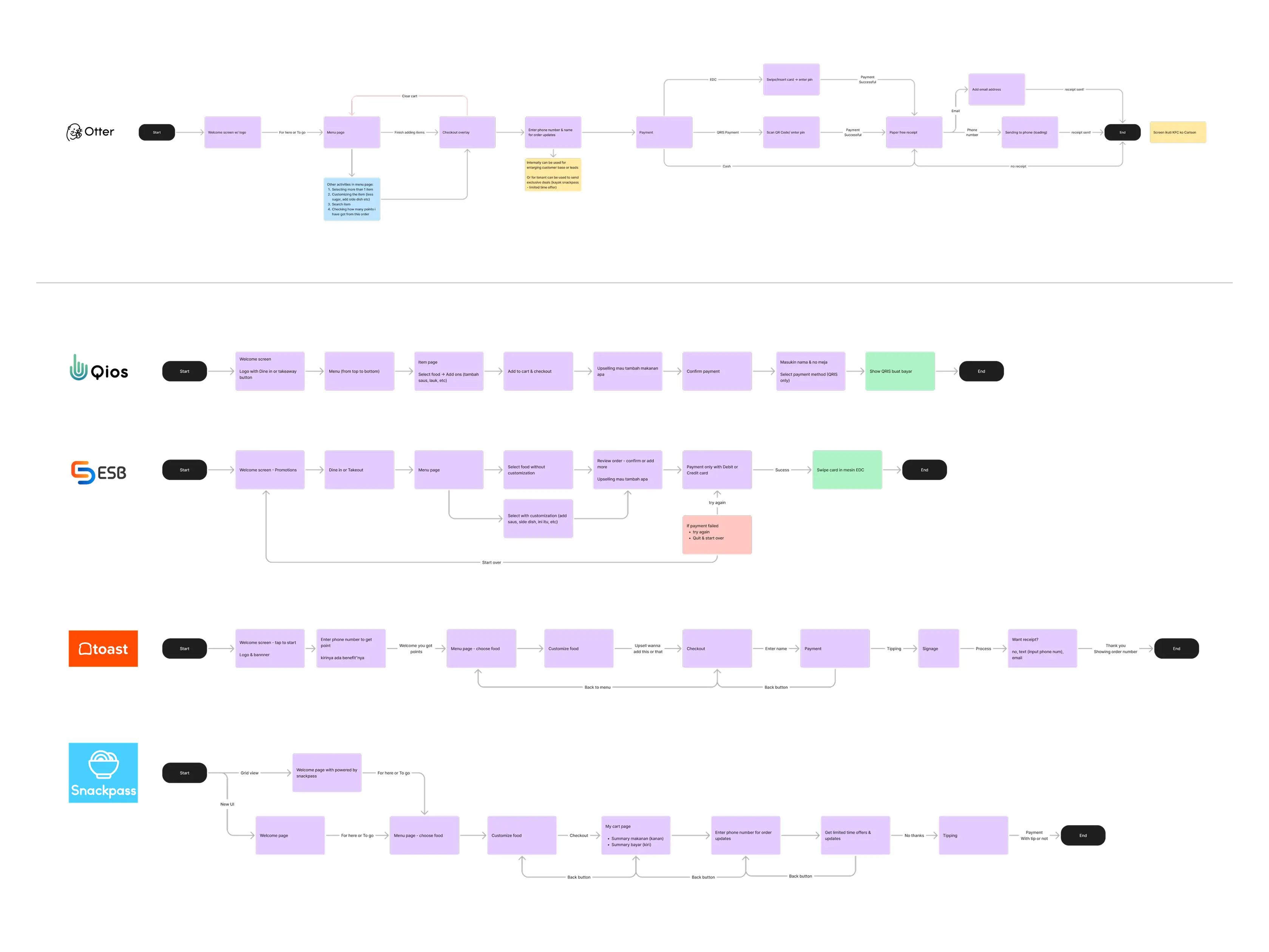
After we finished combining the screenshots are drawing out user flows from there. We've got some insights how we want to design the Kiosk.
Familiar, predictable patterns
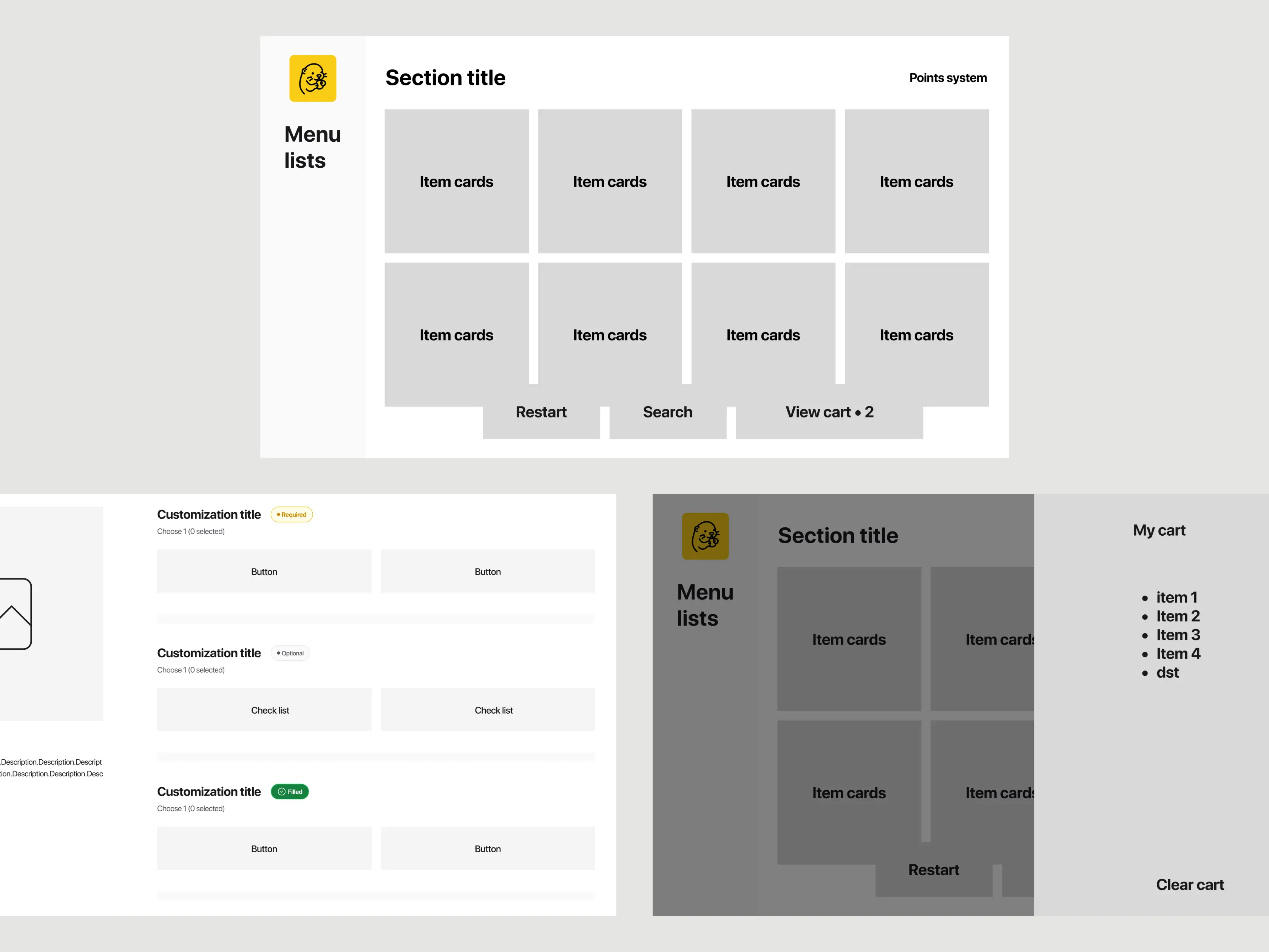
Menu of always on the right
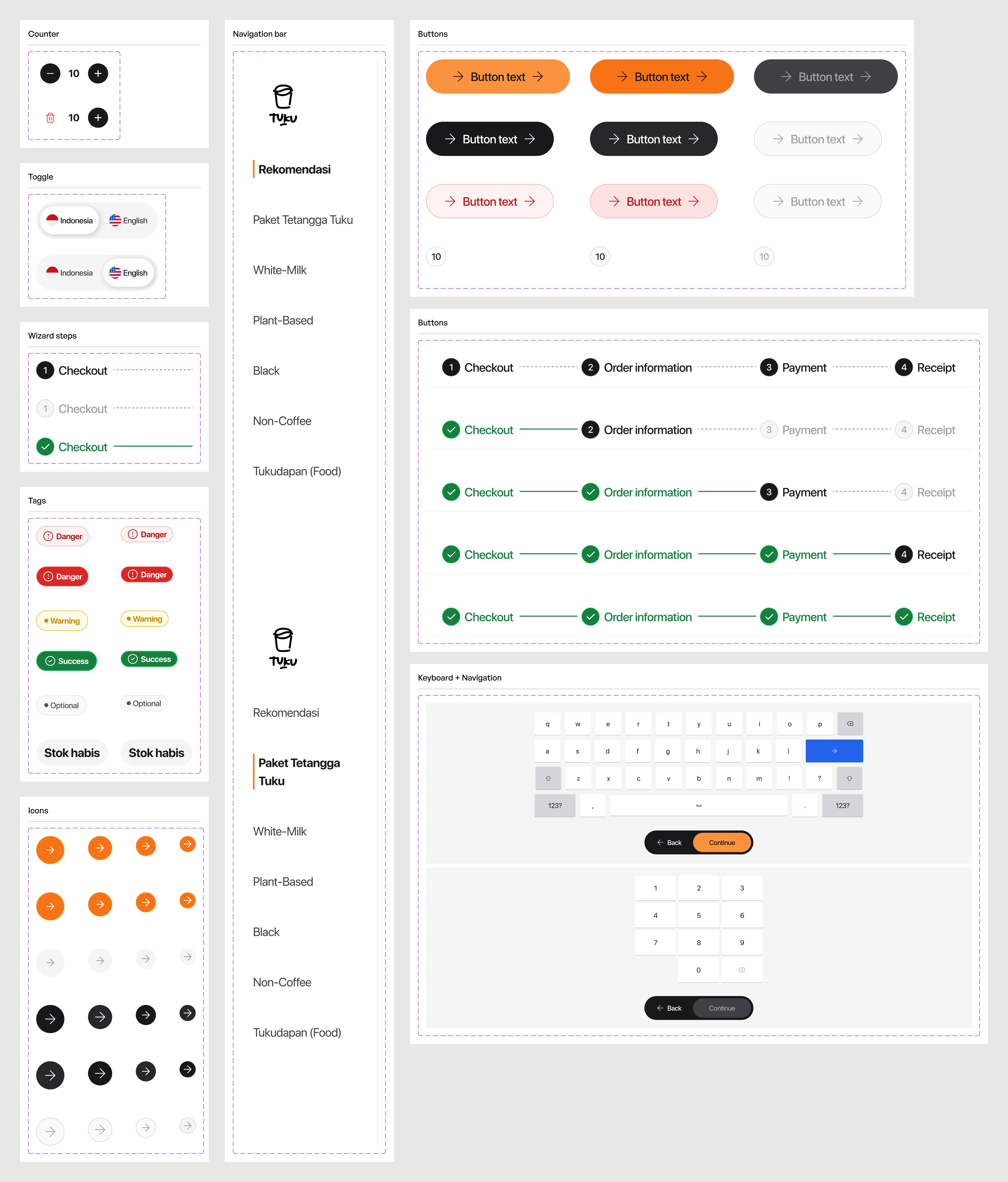
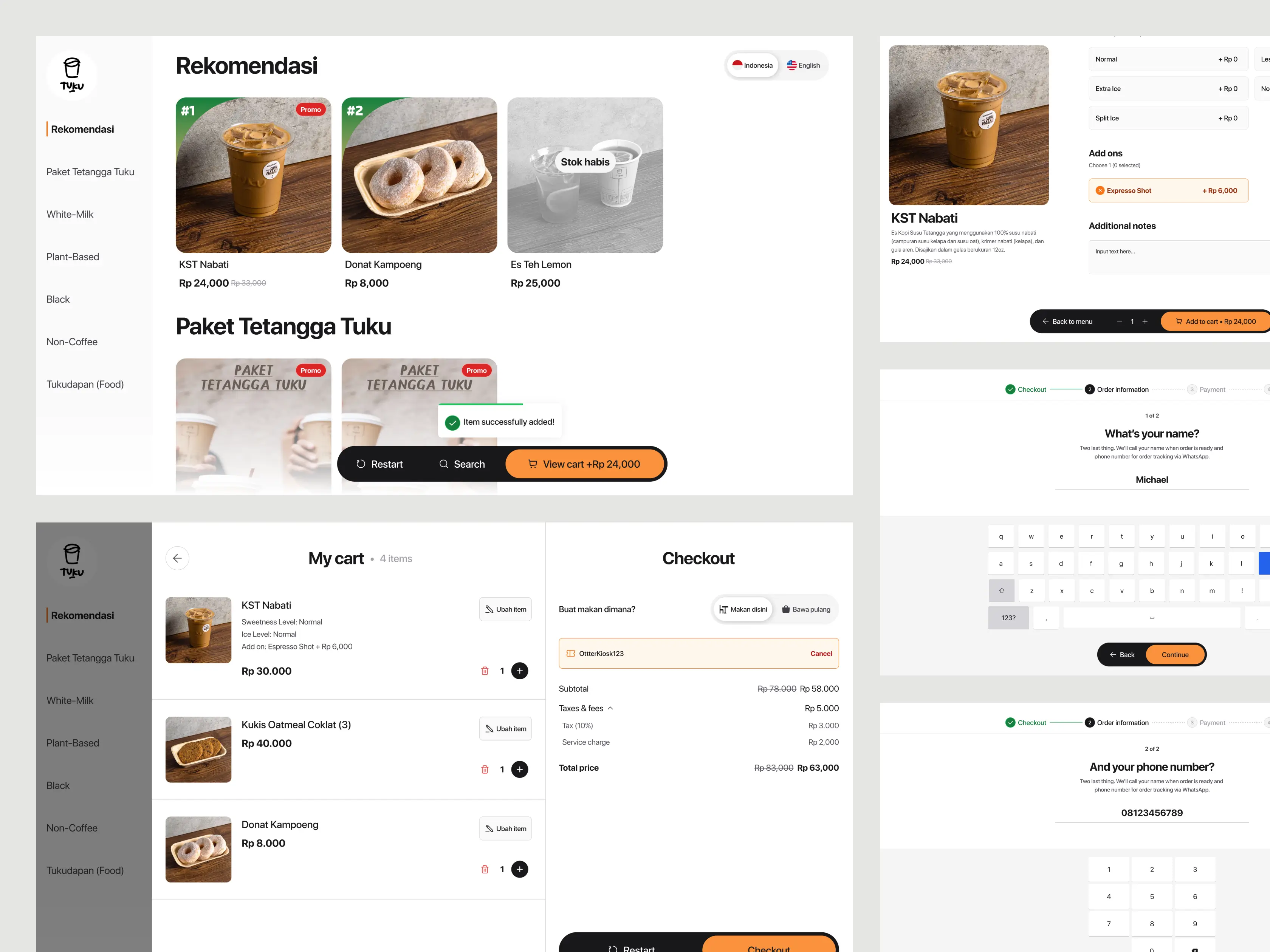
Components and card states mirror common mobile commerce patterns (GoFood and GrabFood) to lower the learning time and first‑time users can complete an order unaided.
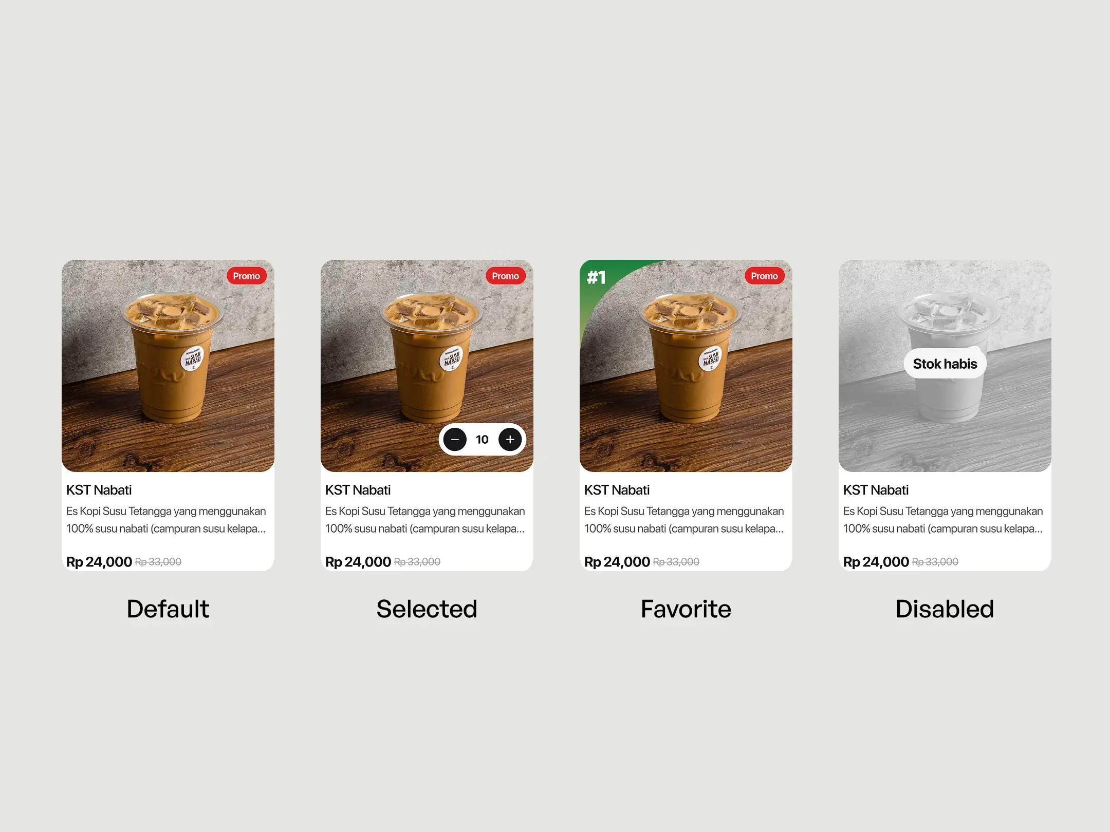
Large, readable cards and buttons with obvious states for selected, disabled, and added items because our target market is not specified by age. It’s for all ages.
Always‑in‑control navigation
Restart is always visible, never hidden behind a back icon.
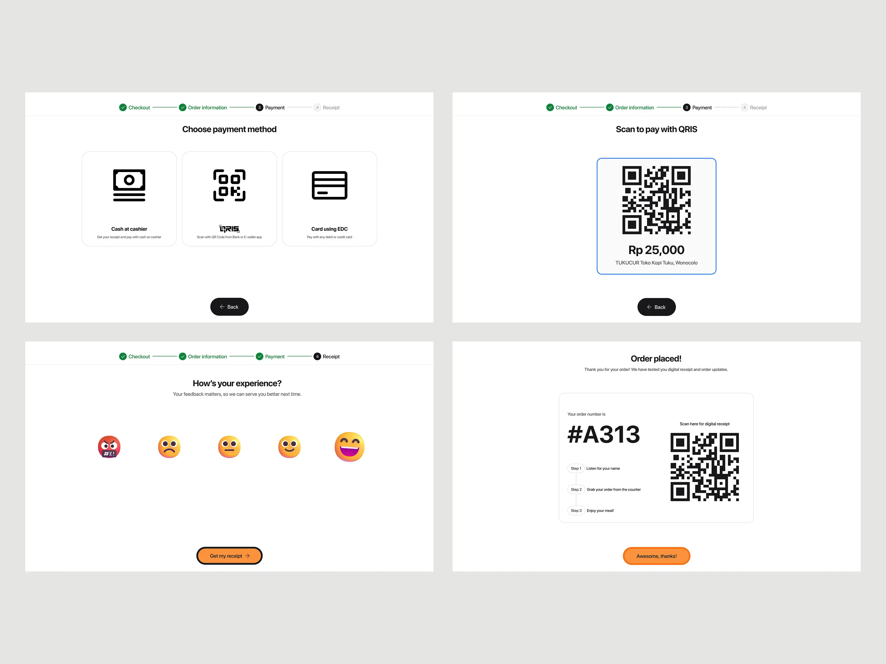
Clear step indicators on checkout flow to communicate clearly where is the user now.
Dine in or take away is selectable at checkout and can be changed without restarting the order. So, it saves users time if they changed their mind.
Localization & reducing physical fatigue
Localizing research insight by removing tipping & debit card signage screen because in Indonesia, we are not accustomed to tipping and we use swipe or insert our card enter the PIN.
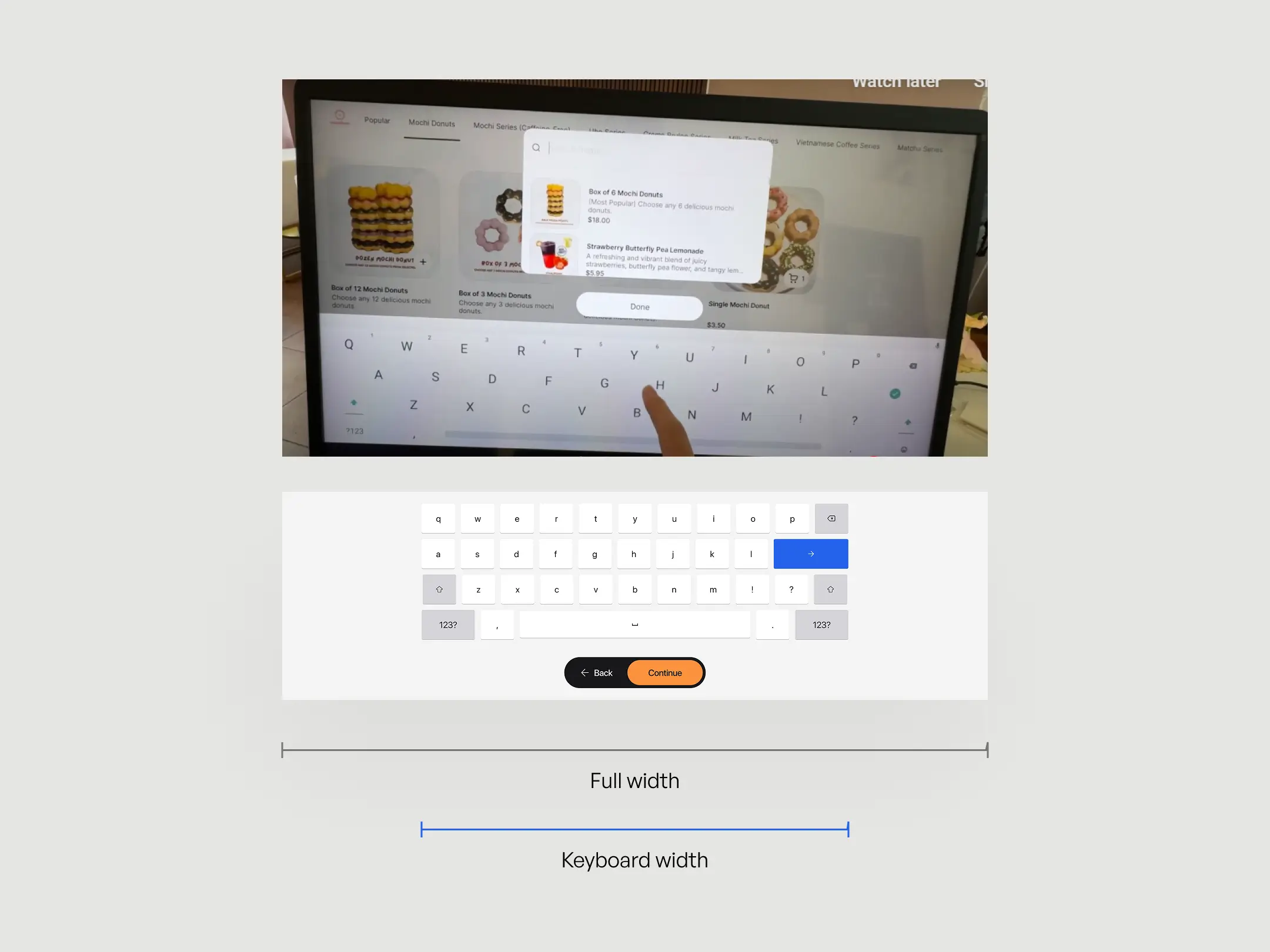
Last thing is the keyboard while typing on the Kiosk. two of the competitors have full screen keyboard which can bring out users’ physical fatigue because the travel distance from one keycap to other keycap is too long.
Design process
Before we design anything, I took inspiration for the keyboard from Google TV Design Kit and after that we made wireframes first for the key screens because we already made a style guide before and have some color variables ready for hi-fi design.
While designing the hi-fi screens we also created design system using atomic design to manage our components. It was important for us to have a robust & replicable component to ensure consistency in every screen the user sees
Impact to Otter customer businesses
Sisters Matcha & Coffee
We use Otter at Sisters Matcha & Coffee, and it has made ordering so much easier for both our customers and our team. Customers can self-order without needing a cashier, but we still have flexibility when assistance is needed.

The Good Blend
Since we used Otter, we directly feel the difference, now all order & payment issues are fully automated, no hassle and the kitchen become more efficient. The Good Blend also manages to sell 150+ cups without missing a single order and without the long queue drama.
Client
testimonial

He is incredibly organized, communicates clearly, and consistently delivers designs that meet our expectations. What stands out most is his strategic approach, he doesn’t just design based on aesthetics, but takes the time to understand the product, the target audience, and our business goals.
Michael sets realistic timelines and achievable milestones, which makes the collaboration smooth and efficient. His thoughtful process ensures every design decision has a clear purpose and aligns perfectly with our vision for Otter Now.

Carlson Ivanic Jansen
CEO • Cofounder Otter Indonesia